top of page
Brand Identity Projects
Visual comunication
Brewed Awakening, a boutique coffee shop


The logo is rich in meaning: the circle represents warmth, community, and connection. Interwoven into it are ties inspired by both knitting and flowers, symbolizing nature, sustainability, craftsmanship, and human bonds. The right angles bring a sense of stability and quality.
The result is a unique emblem that still feels familiar, as if you’ve seen it before… a balance that makes it memorable.
In design, we aim for the perfect harmony between uniqueness and familiarity, complexity and simplicity, to create a lasting impression.
Colors and typography were carefully selected and crafted to reflect the same vision.
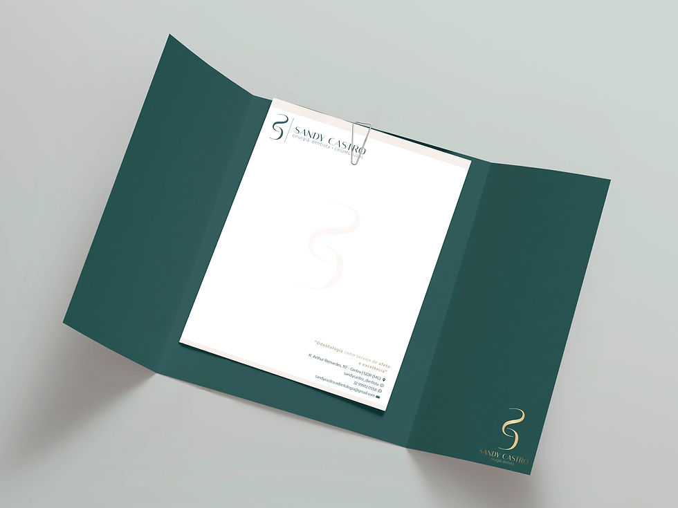
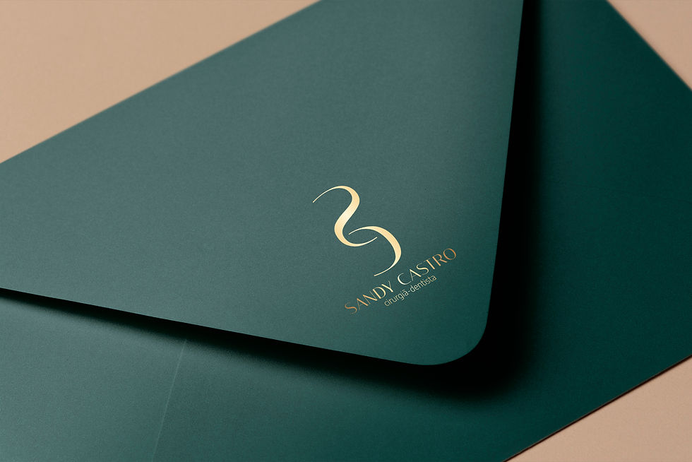
A selection of other visual identity projects


1/1
bottom of page